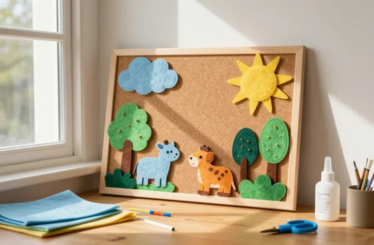
6 Creative Craft Business Logo Ideas & Branding Tips
Ready to transform your craft biz into a magnetic brand without hiring a full marketing team? These six completely unique DIY logo ideas will spark personality, boost credibility, and look stunning on every storefront, tag, and Instagram post. Trust me, you’ll love the blend of creativity and practicality in each project.
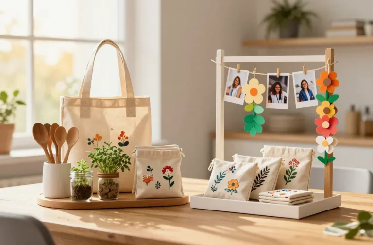
Let’s dive into six totally distinct concepts that are as fun to make as they are easy to implement. Each idea stands alone, so you can mix and match vibes without reusing a single idea. Get ready to pin, share, and actually use these branding magic tricks.
1. Hand-Drawn Icon Glyphs: Your Signature Stamp Logo
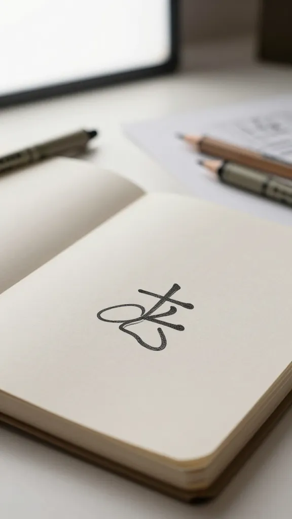
Picture a clean, hand-drawn glyph that captures the heart of your craft—simple, memorable, and effortlessly artisanal. This logo feels personal, like a tiny stamp of your studio’s soul, and it scales beautifully from business cards to packaging.
Materials Needed
- Sketchbook or tracing paper
- Fine liner pens (0.05–0.3 mm)
- Digital scanner or high-quality photo
- Free or affordable vector tool (Inkscape or a paid option like Illustrator)
- Optional: light box for clean tracing
How to Make It
- Brainstorm a single, defining symbol that represents your craft (e.g., a needle, a spool, a leaf, a utensil). Keep it simple—one strong shape, not a busy scene.
- Sketch multiple versions on paper, then pick the cleanest form. Refine curves until it feels balanced.
- Trace or scan the best sketch and convert to vector. Clean up anchor points for crisp lines at any size.
- Pair your glyph with a bold, timeless wordmark. Use a classic typeface for the name and keep color minimal for maximum versatility.
Pro Tips
- Go for high-contrast—black on white works wonders for prints and embroidery, but a solid color can feel modern and friendly.
- Give the glyph a subtle tweak for different products (a small dot, line, or curve variation) while keeping the core mark intact.
- Test at small sizes. Your icon should be recognizable on tags, labels, and social avatars.
End Note
Who would love this? Makers who want a timeless, hand-crafted vibe that translates well across packaging and social media. It’s cozy, memorable, and totally you.
2. Monogram With Textile Texture: Warmth in a Mark
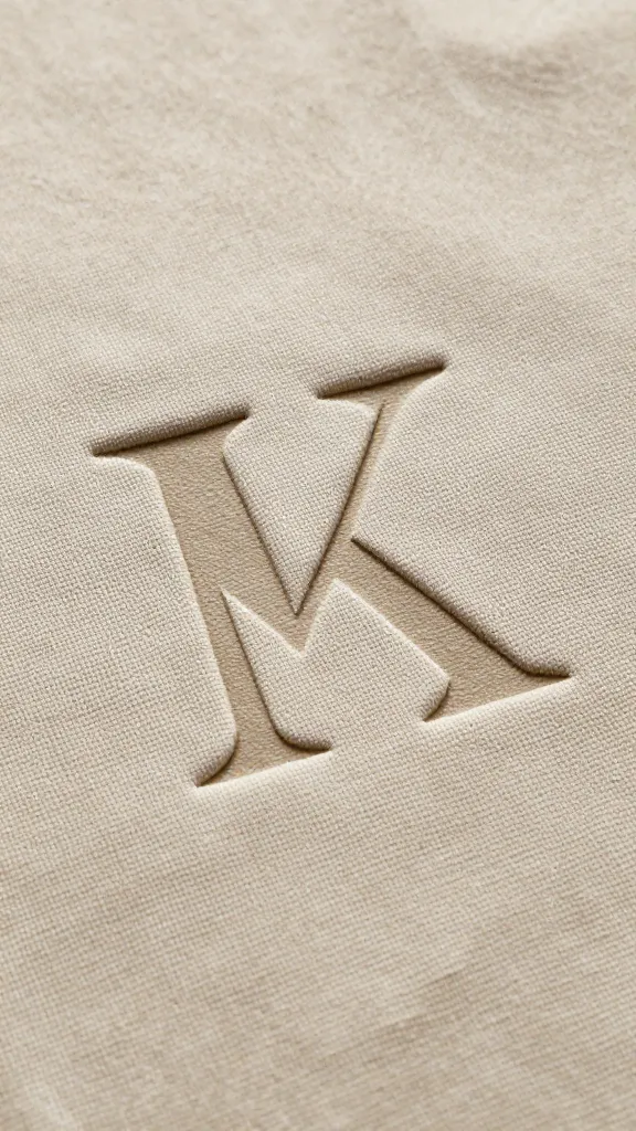
Envision a polished monogram layered over a soft textile texture—think linen, burlap, or canvas. This approach feels premium yet approachable, perfect for brands selling handmade textiles, yarn, or home goods.
Materials Needed
- Vector software or a free editor
- Texture swatches or brushes (digital or scanned fabric textures)
- Two complementary fonts (one serif, one sans-serif)
- Color palette with 2–3 tones
How to Make It
- Design a bold initial or stacked initials that represent your business name.
- Overlay the monogram on a fabric-like texture. Adjust opacity to let the texture show through just enough.
- Choose a refined color pair—think earthy neutrals with a pop of terracotta or deep teal.
- Pair with a clean wordmark and ensure legibility at small sizes.
Pro Tips
- Experiment with a faux-embroidery effect by adding subtle stitch lines around the edges.
- Use the texture as a background on packaging or hang tags for a tactile feel.
End Note
Who would love this? Brands leaning into cozy, high-quality goods—quilts, ceramics, or hand-dyed fabrics. It feels luxurious but accessible.
3. Flat Icon + Playful Color Blocking: Modern Craft Studio Vibe
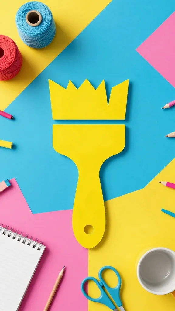
Imagine a bright, flat icon that instantly communicates your craft niche, paired with bold color blocking. This is cheerful, modern, and perfect for a studio that thrives on color, whimsy, and a clean look.
Materials Needed
- Vector design software
- Three to four bold color swatches
- One or two simple icons representing your craft
How to Make It
- Choose a simple icon that captures your craft (e.g., a paintbrush, yarn ball, crochet hook).
- Create a flat, solid version of the icon with thick lines for strong visibility.
- Block a color behind the icon and add a contrasting color for the wordmark. Keep to two colors for cohesion.
- Test the logo in black and white to ensure it holds up without color.
Pro Tips
- Use this logo across social media banners and shopfronts for a unified, eye-popping look.
- Consider seasonal color swaps to keep branding fresh without changing the mark.
End Note
Who would love this? Color-forward crafters, makers with a pop-art sensibility, or shops that appeal to a younger, modern audience.
4. Upcycled Shape Emblem: Eco-Chic Branding
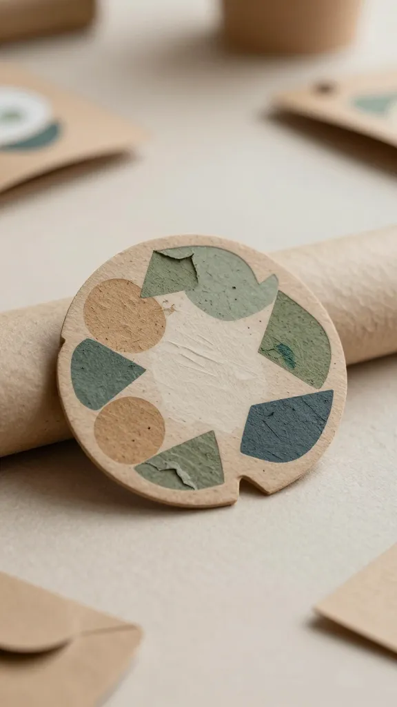
Embrace sustainability with an emblem built from upcycled shapes—think recycled paper textures, imperfect circles, and overlapping forms. It’s a statement of values as much as a logo, and it looks incredible on packaging and tags.
Materials Needed
- Scanned textures from recycled paper, kraft, or fabric scraps
- Vector editor
- Transparent PNGs for versatile use
How to Make It
- Assemble a few imperfect shapes (circles, diamonds, or organic blobs) that echo your craft’s essence.
- Overlap shapes to create a cohesive emblem. Don’t worry about perfect symmetry; charm comes from the imperfect edges.
- Apply a subtle color palette inspired by nature—sage, sand, charcoal, blush.
- Pair with a simple sans-serif wordmark to keep the focus on the emblem.
Pro Tips
- In branding materials, use the emblem alone as an icon on product labels or social avatars.
- Experiment with a “folded” texture to hint at handmade origins without needing photos.
End Note
Who would love this? Eco-conscious makers, upcyclers, and brands that want to tell a story of sustainable craft at a glance.
5. Stamp-Inspired Badge: Classic Craft Shop Vibes
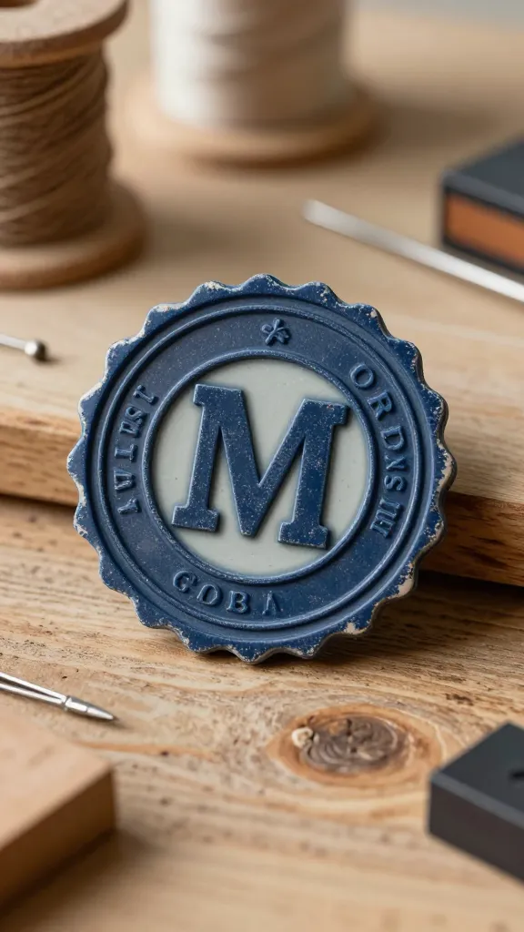
Old-school stamp vibes never go out of style. A circular badge with a distressed edge conveys reliability and a dash of nostalgia—perfect for shops that want a trustworthy, handmade feel.
Materials Needed
- Bold sans or slab-serif font
- Texture for distressing (optional)
- SVG or vector files
How to Make It
- Design a circular badge with your initials or a short wordmark in the center.
- Add borders, a tagline, and a small icon that hints at your craft (needle, leaf, or thread).
- Texture the edge with light distressing to mimic an ink stamp on paper.
Pro Tips
- Use the badge on labels, storefront signs, and packaging for a cohesive look.
- Keep the color palette limited to 2–3 tones to preserve that vintage badge feel.
End Note
Who would love this? Makers with a traditional aesthetic, shop owners who value heritage branding, and brands that want to feel established and trustworthy.
6. Nature-Inspired Silhouette: Organic, Calm Branding

A nature silhouette captures the essence of handmade goods with an organic, calming vibe. A single, graceful shape—like a leaf, bird, or wave—paired with gentle typography communicates simplicity and care.
Materials Needed
- Vector tool
- Soft color palette (greens, blues, sand tones)
- Clean, legible typeface for the brand name
How to Make It
- Sketch a single elegant silhouette that aligns with your craft (e.g., a leaf for botanical goodies, a feather for handmade journals).
- Convert to a crisp vector, simplifying curves for maximum versatility.
- Place the silhouette beside or above a refined wordmark. Use whitespace to let the mark breathe.
- Apply a subdued, nature-inspired color palette to keep the look timeless.
Pro Tips
- Test on product tags, business cards, and digital banners to ensure consistency.
- Pair with natural textures in photography for a cohesive brand aesthetic.
End Note
Who would love this? Brands rooted in nature, zero-waste shops, or makers who want a tranquil, timeless identity that feels organic.
Conclusion
These six completely unique DIY logo concepts invite you to play, experiment, and brand your craft with personality. Each idea stands on its own, so you can pick one that best fits your story or combine elements to craft a signature look that’s unmistakably you. Ready to pin, test, and reveal a fresh brand that feels as good as your handiwork?